
5 Design Tips for Better Teaching Slides
Good teaching slides do more than look attractive. They help lecturers explain ideas clearly, organize information effectively, and support students in understanding the material. Whether used in a classroom or an online lesson, well-designed slides can guide attention, simplify complex concepts, and encourage meaningful engagement. By presenting information in a clear and visually organized way, lecturers can help students focus on key ideas rather than become overwhelmed by too much information.
The good news? You do not need advanced graphic design skills to create effective teaching slides. A few basic design principles can make your slides clearer, more organized, and easier for students to follow. From choosing readable fonts and using white space effectively to creating visual hierarchy and selecting the right colors, small design decisions can make a meaningful difference in how students engage with and understand your teaching materials.
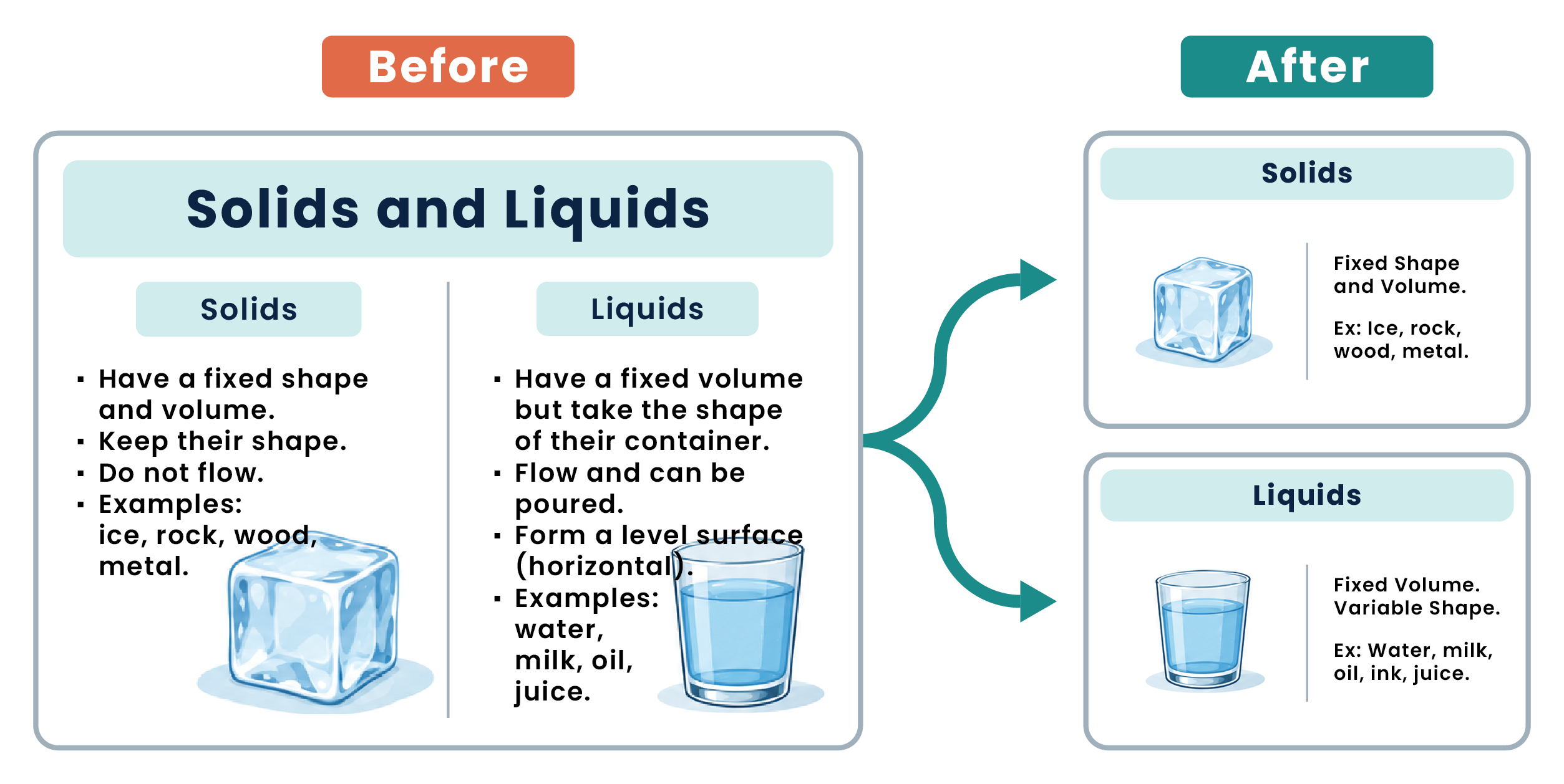
1 – Keep It Simple
Trying to fit too much information onto a single slide can overwhelm students and make the main message difficult to identify. Teaching slides work best when they support your explanation rather than reproduce everything you plan to say.
Focus each slide on one central idea. Use short statements, highlight key points, and break complex explanations into smaller sections. Provide detailed readings or supplementary notes separately when needed.
Tip: Choose your most crowded slide and split it into two focused slides.
2 – Choose Readable Fonts
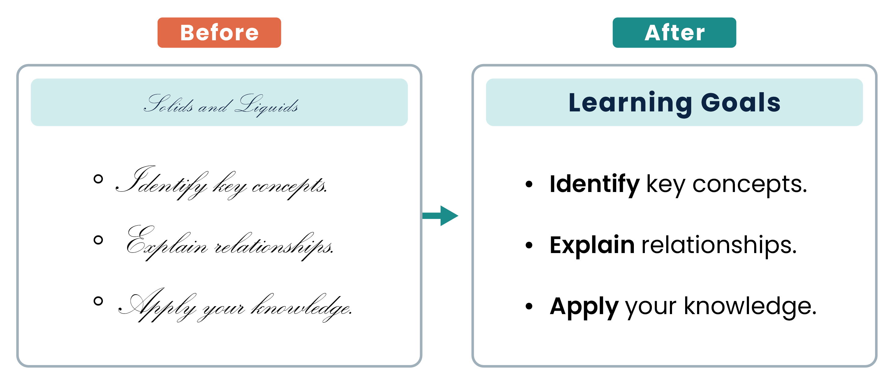
Students should be able to read your slides comfortably, including from the back of the classroom. Clear, readable typefaces help them focus on the content.
- Use simple fonts such as Arial, Aptos, or Calibri.
- Limit yourself to one or two font families.
- Make titles noticeably larger than body text.
- Use bold to emphasize key information, not entire paragraphs.
Tip: Check your slides in presentation mode, from the back of the classroom.
3 – Make White Space Work for You
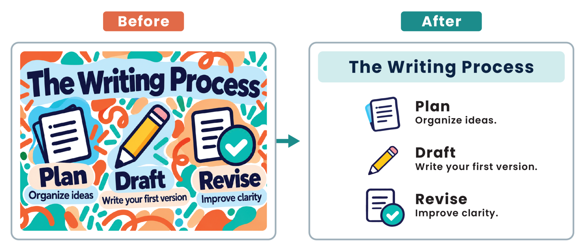
White space, also known as negative space, is the empty area around text and visuals. It does not have to be white, it gives your content room to stand out and helps students focus on key ideas.
Leave clear margins, separate sections with space, and group related content together. Place explanations close to the visuals they describe so students can easily connect them. Avoid overcrowding slides with text or decoration.
Remember: Empty space is not wasted space.
4 – Keep Your Design Consistent
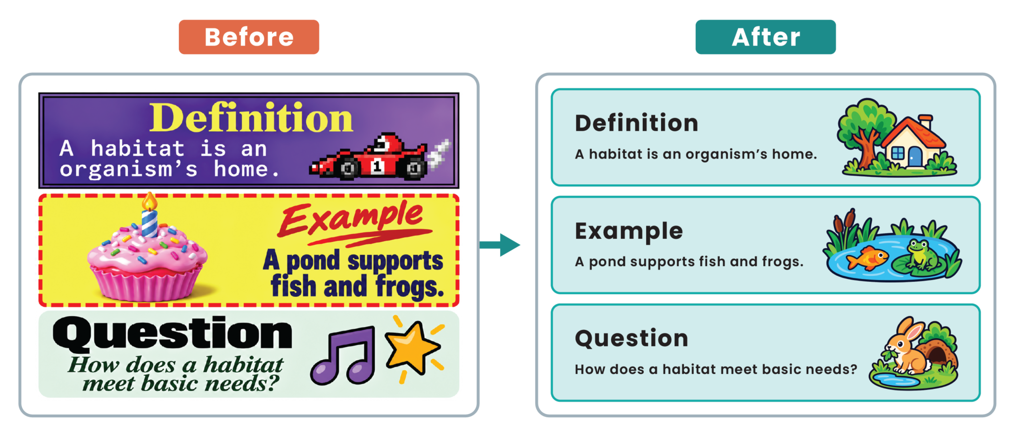
A consistent design helps students follow your slides and identify key information. Maintain clear visual cues throughout the lesson. Apply these four principles to create a cohesive, well-organized layout that students can easily follow:
- Color – Use a simple palette with one accent color.
- Contrast – Make text stand out against the background.
- Alignment – Keep elements consistently aligned.
- Visual Hierarchy – Make key information stand out.
Tip: Do not rely on color alone to communicate meaning.
5 – Use Visuals That Support Learning
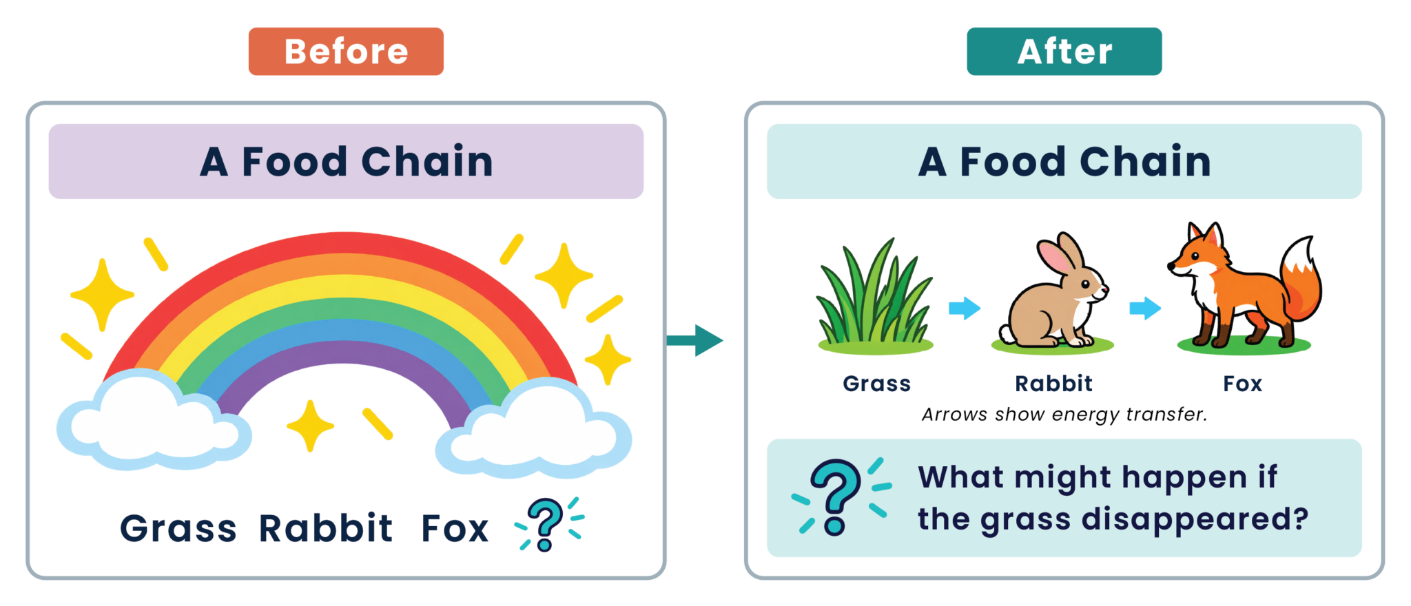
Choose visuals that help students understand key ideas. Use diagrams to explain processes, charts to present data, and images to illustrate real-world examples. Keep labels clear and remove distracting decorations.
Encourage active participation by including a thought-provoking question, a short case study, or a discussion prompt that invites students to share ideas, reflect on the lesson, and apply what they have learned to real-world situations.
Tip: Before adding a visual, ask: “What will this help students understand?”
Improving your teaching slides does not require a complete redesign. Start with small changes: simplify a crowded slide, improve text readability, or replace a decorative image with a meaningful visual. These adjustments can help students follow your explanation and focus on the ideas that matter. As you refine your slides, consider how students respond during the lesson. Notice what prompts questions, supports discussion, or needs further explanation, and use those observations to guide your next revision. Thoughtful slide design creates more room for understanding, interaction, and learning.
Need further assistance with your teaching slides? Contact us at [email protected]. We’re happy to help!